


”We are aligning who we are in a cohesive visual identity with concise messaging. We will build brand trust with our decision makers for that smooth quick connection.
Thomas LytleASCD Creative Director
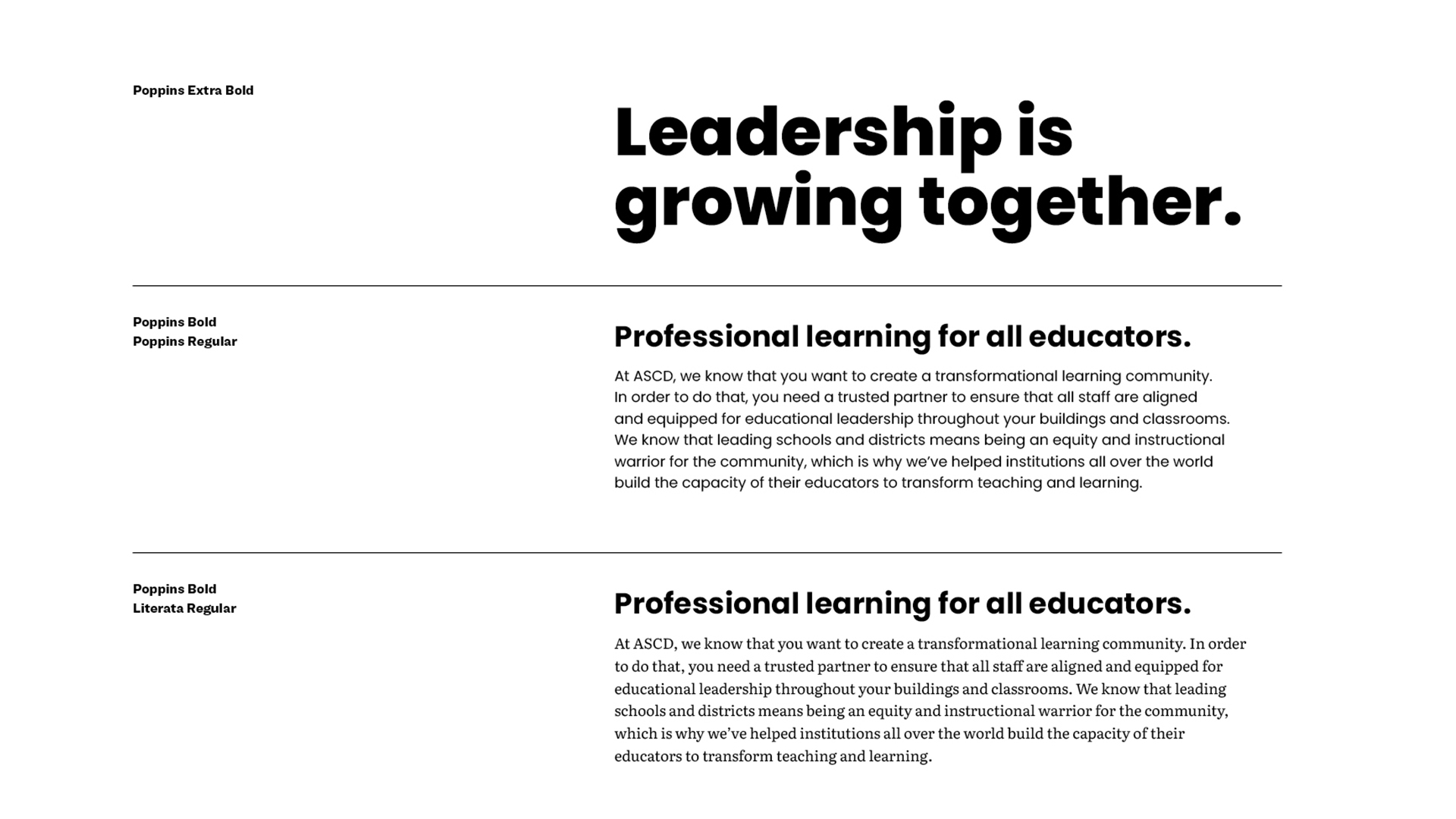
At ASCD, we know that you want to create a transformational learning community. In order to do that, you need a trusted partner to ensure that all staff are aligned and equipped for educational leadership throughout your buildings and classrooms.
This is the new voice for ASCD which would help guide ASCD’s digital transformative strategy. With our new voice and strategy, we needed to re-envision ASCD’s brand to be relevant and relatable. As Creative Director for ASCD, I led the rebrand journey and execution of the new brand, alongside my Art Director, Donald Ely, and consultant Dylan Gerard from Appnovation.
Our key results for the rebrand:
- Increase brand and educator engagement by simplifying and unifying the brand experience.
- Develop integrated approach to marketing and product initiatives that drive revenue.
- Expand and drive brand awareness for B2B.
The What and Why
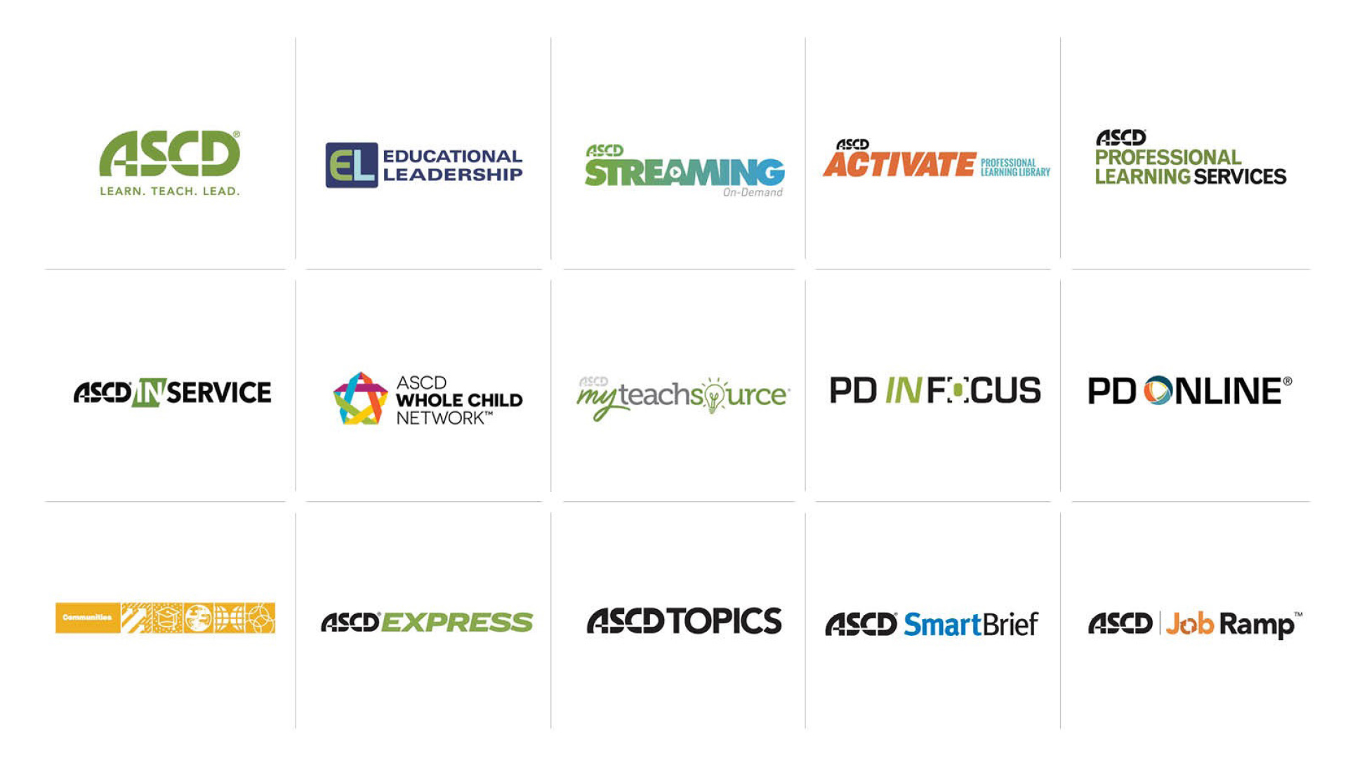
This was ASCD’s previous brand and visual systems and one of the reasons why we needed the rebrand. Immediately it’s recognizable that there’s no cohesiveness between these different products and services. ASCD as a stand-alone visual identity doesn’t have a clear concise presence for decision makers to immediately gravitate towards and recognize.
What we set out to do, was to create a brand that has impact, and meaning in the education space. A brand that we can use as our north star and align all storytelling behind it. What we needed to create is brand trust.
The Start of the Journey
We started off with our Brand Story and Persona’s and made sure that our visual identity could speak to both of those. Analyzed and researched ASCD’s past visual identities to see if we could use anything as inspiration. Looked at our competitors to make sure that we would stand out from the crowd. Lastly, looked at a wide variety of different designs, colors, typography, photography, illustrations, and design systems that would help spark an idea or help push a concept further.
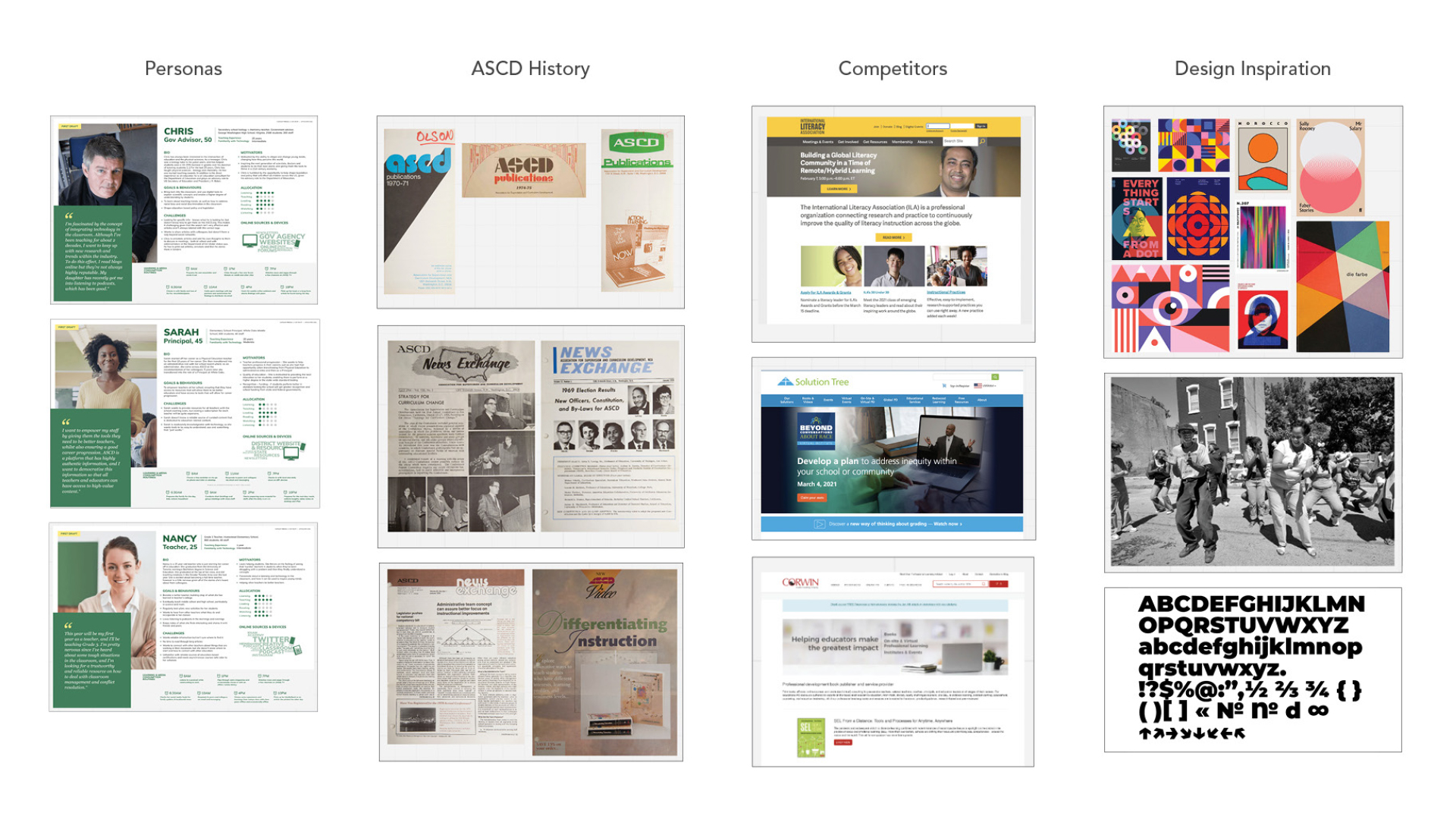
Moodboards
We set out to create three moodboards. A mood board is about feeling and hierarchy. It’s a collection of photography, illustrations, key words, colors, and typography. They are about capturing a feeling, defining key elements and their hierarchy, a visual identity that is ownable. Moodboards are not your final brand design, but come close to it. Moodboards can evolve, and help influence your digital and print space.
We ended with three completely unique visual identities that spoke our brand. It would represent all levels of educators and strongly unify ASCD.

Surveys
We surveyed different groups to help make sure that we were speaking to our audiences. Engaged with educators and leaders in the field. Communicated and walked through the process with ASCD staff to have them be a part of the brand ownership. Lastly, engaged with young adults to gain their perspective and to help determine ASCD’s brand of the future.
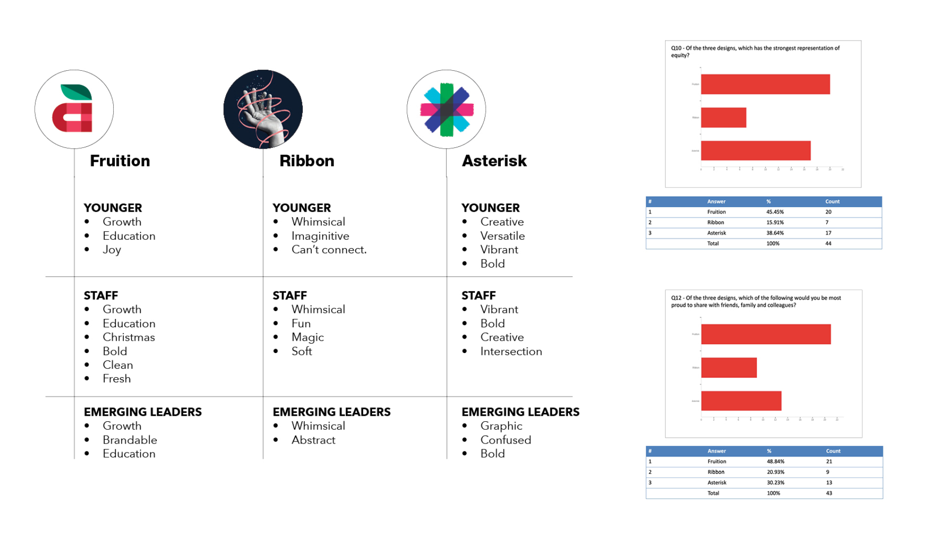
All data and feedback sources collected internally and externally pointed towards Fruition being ASCD’s new brand. It has the presence and impact that the organization was looking for.
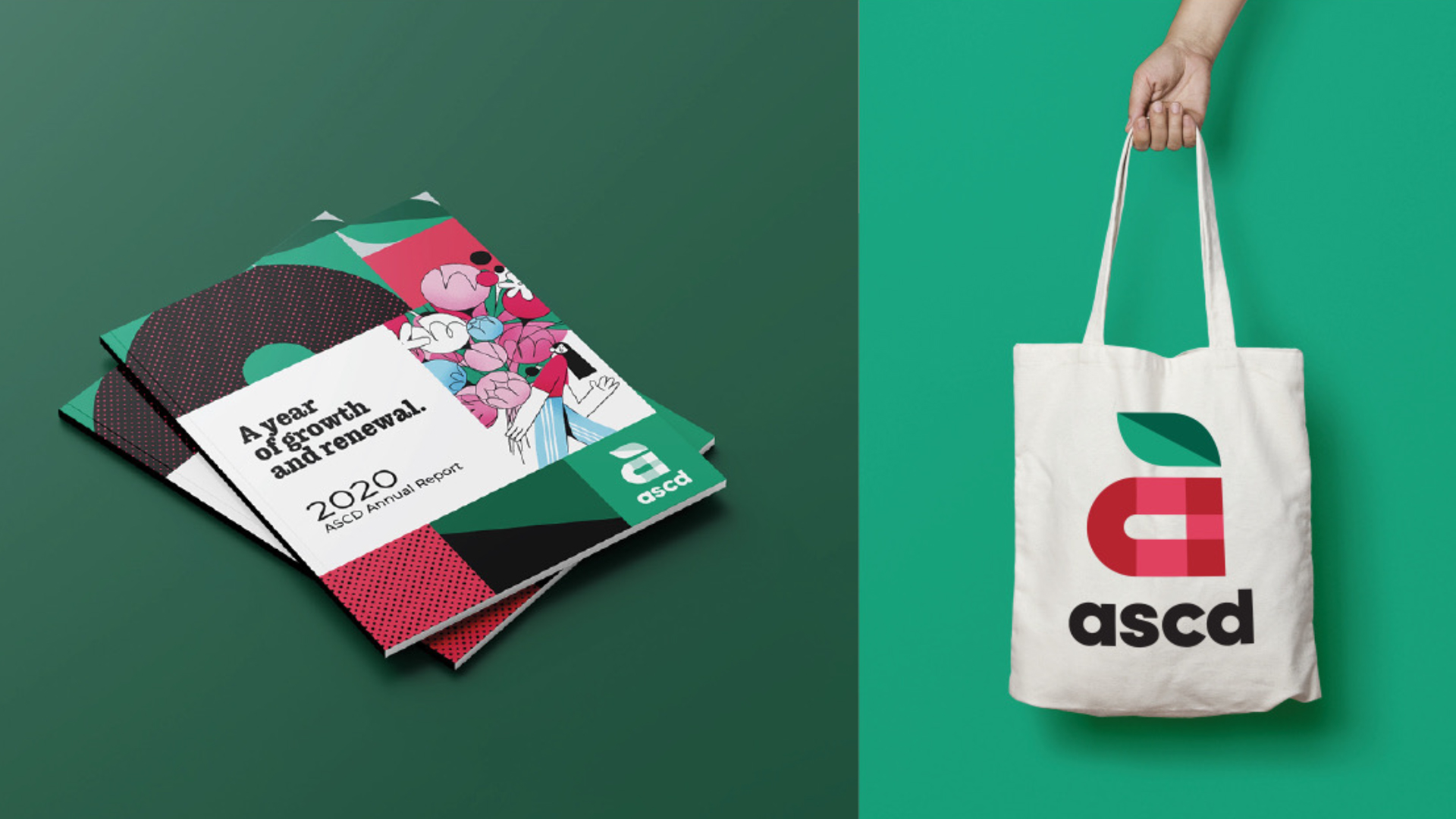
Fruition
The apple is a common trope in education, but that’s the exact reason why we decided to use it, and lean into it. When it comes to creating logo marks, you have to speak a simple, universal language that people understand instantly. This logo direction—for the first time in ASCD’s 77 years of existence—will instantly signify that ASCD is an organization that has ties with education.
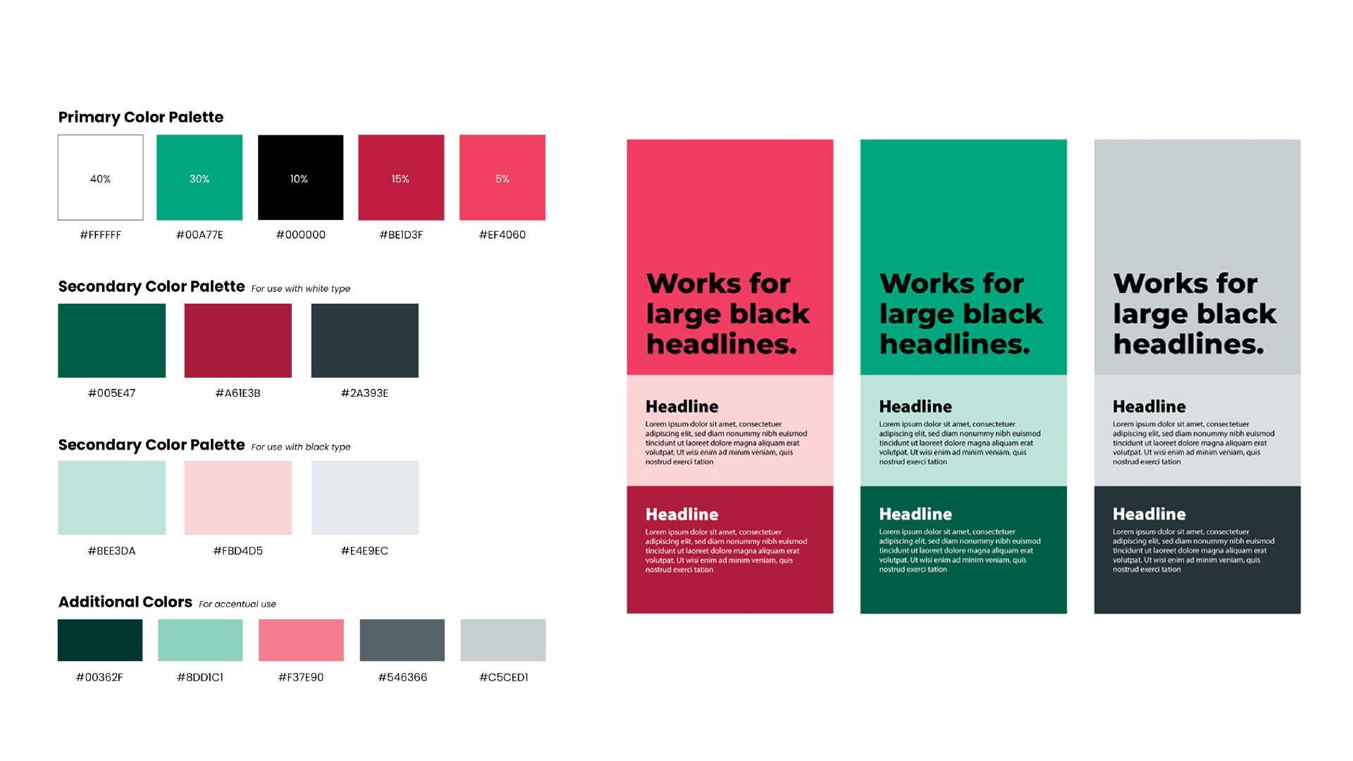
Brand Colors and Accessibility
Breaking down the color palette, green is a little more prominent because it’s soothing to look at and emphasizes growth. This shade of green is different than the previous brand green, but still continues ASCD’s legacy of using green as a brand color. Varying shades of red, gray, black and white are used to emphasize key design elements.
Typography will be dressed in black when on a white background, and when the type is white, it will be on a colored background, the reason for this is two-fold:
- It allows for our copy to be legible in print and digital space.
- It doesn’t compete with selective color used in imagery.
Brand Fonts
The brand typefaces (fonts) that were chosen were Poppins and Literata. Poppins is a sans serif, and will be used as ASCD’s main brand font. It’s friendly, supporting, and suits the new brand voice. These fonts were selected specifically from Google Fonts because of the digital first approach strategy and how easily accessible they are across all digital devices.
Brand Families
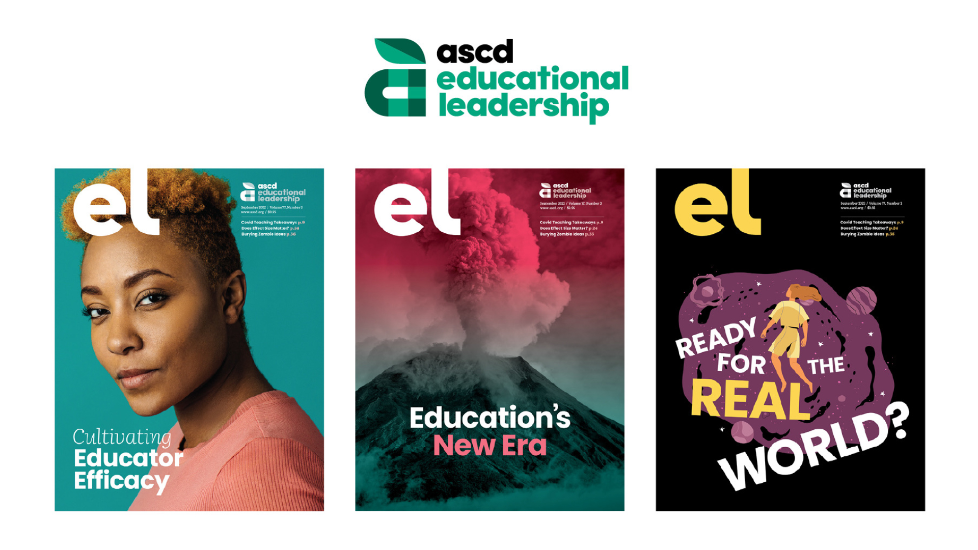
With the new brand solidified, it was time to tackle ASCD’s visual systems. ASCD has many products and services. The 1st image in the very beginning shows how inconsistent and confusing ASCD’s products and services look. We needed to tie all of it together under the new brand umbrella. We achieved this by using our new logo mark, and pairing it to the product name in a consistency that can be applied to all products and services (see below with EL). We applied this pairing treatment to our important products, and made the rest with a branded font treatment.
This example shows Educational Leadership (EL), which is ASCD’s flagship publication. It is a monthly magazine that is printed, mailed, and delivered digitally. With the new brand on its way, EL’s masthead, product logo, and various design elements inside had to be addressed.
The challenge was to keep the original EL masthead by itself, but to signify that EL was a product of ASCD. On the cover of the magazine, that solution is placed on the opposite corner of the masthead to share equal prominence.
ASCD Branding
ASCD Video Brand Story
Video and presentation by Appnovation.