Our brand will be a single voice. When they see our story, they know we are the trusted source for their professional learning needs.

Thomas LytleASCD Creative Director

​​Storytelling is the foundation of design. Utilizing experiences, what they see, read, touch, and hear to craft a story that invites them into the conversation. It relates to the audience and creates trust between the two entities. 

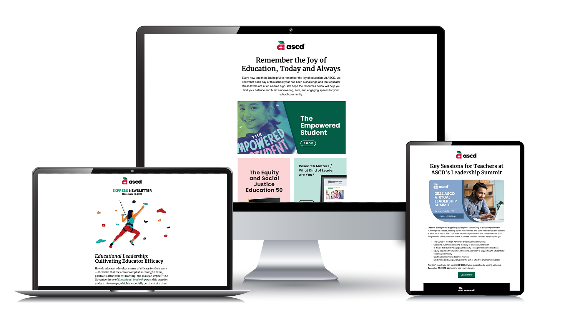
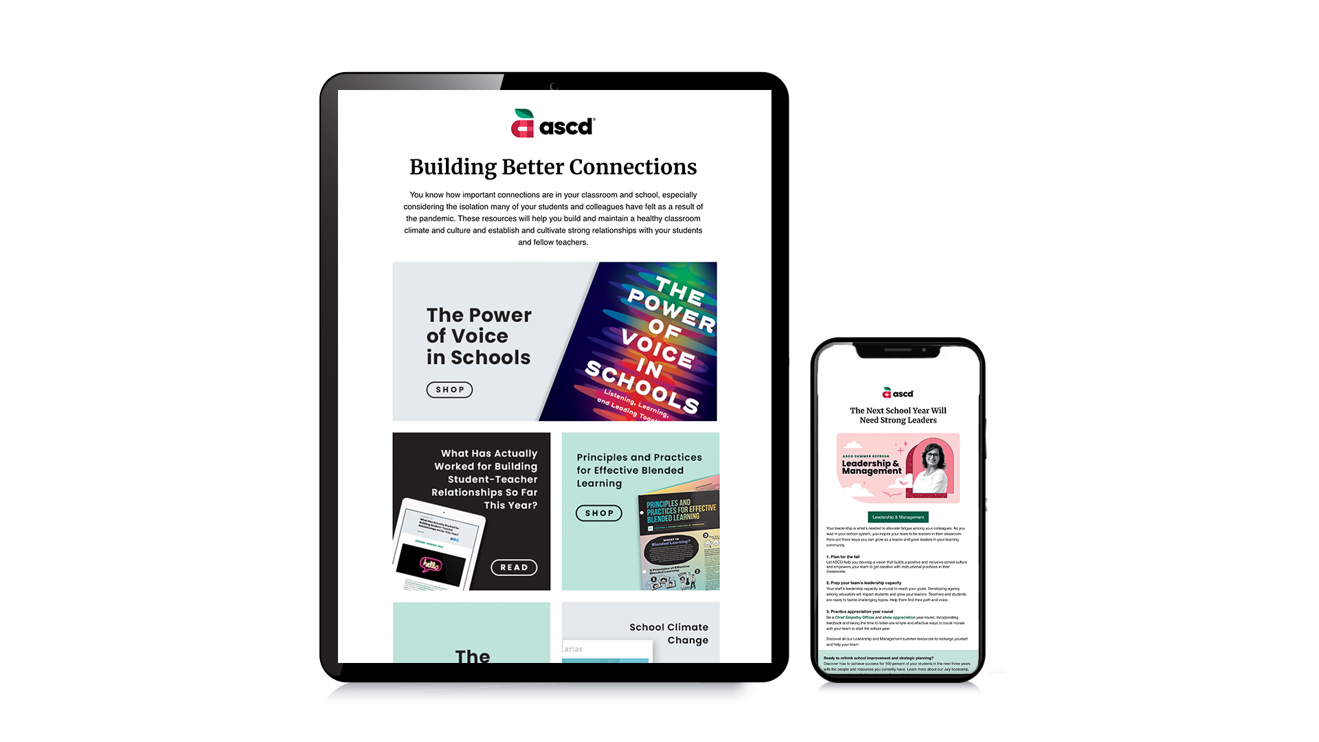
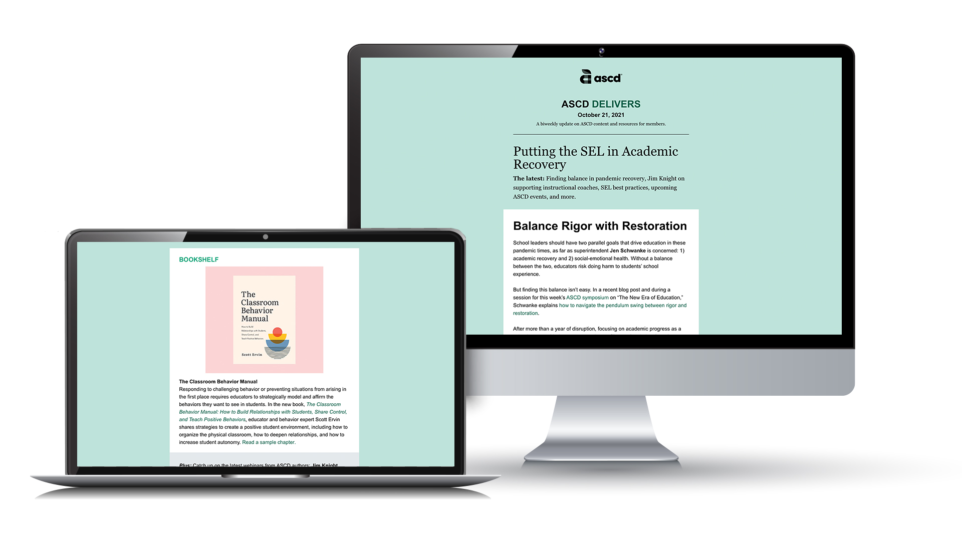
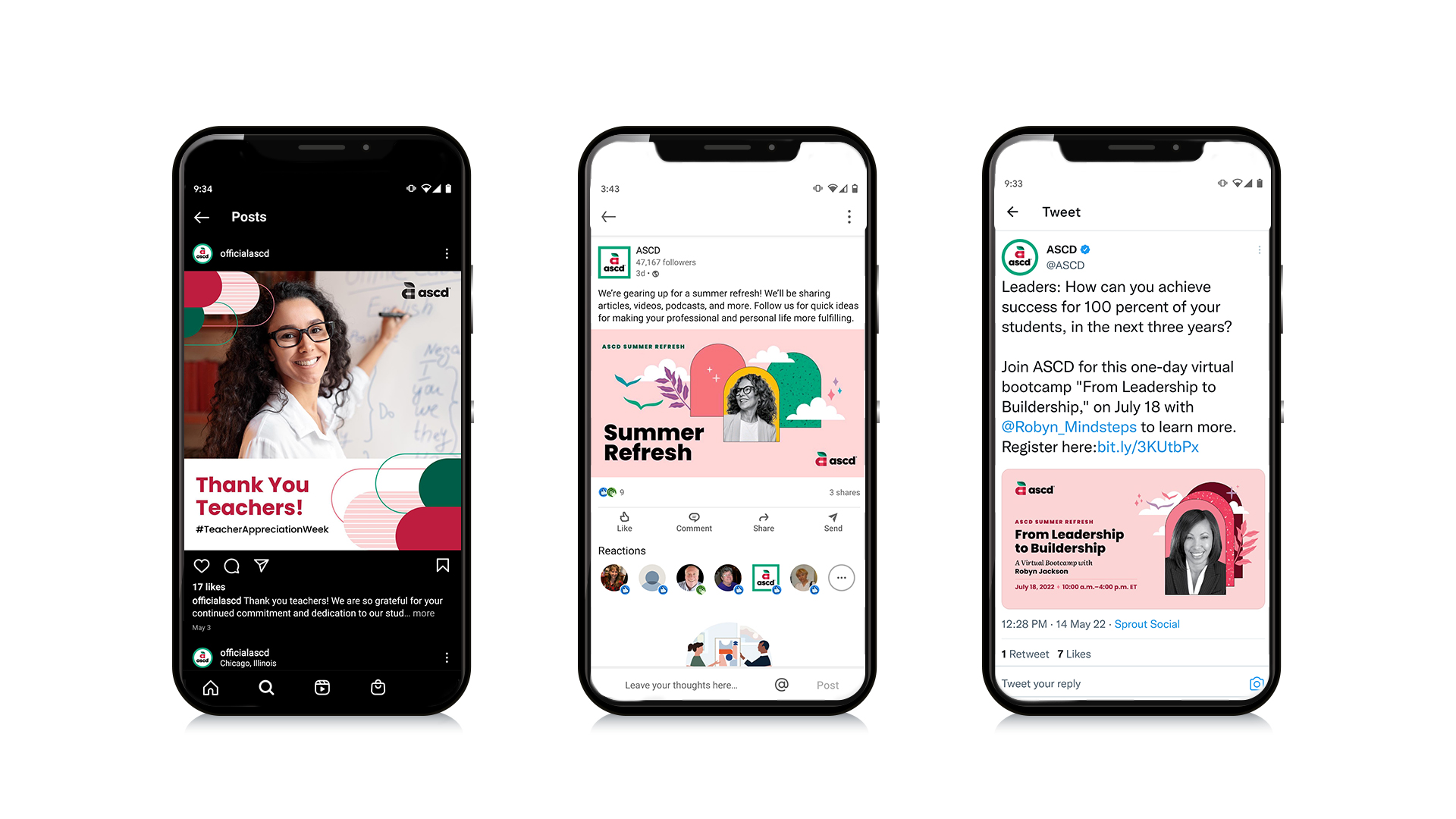
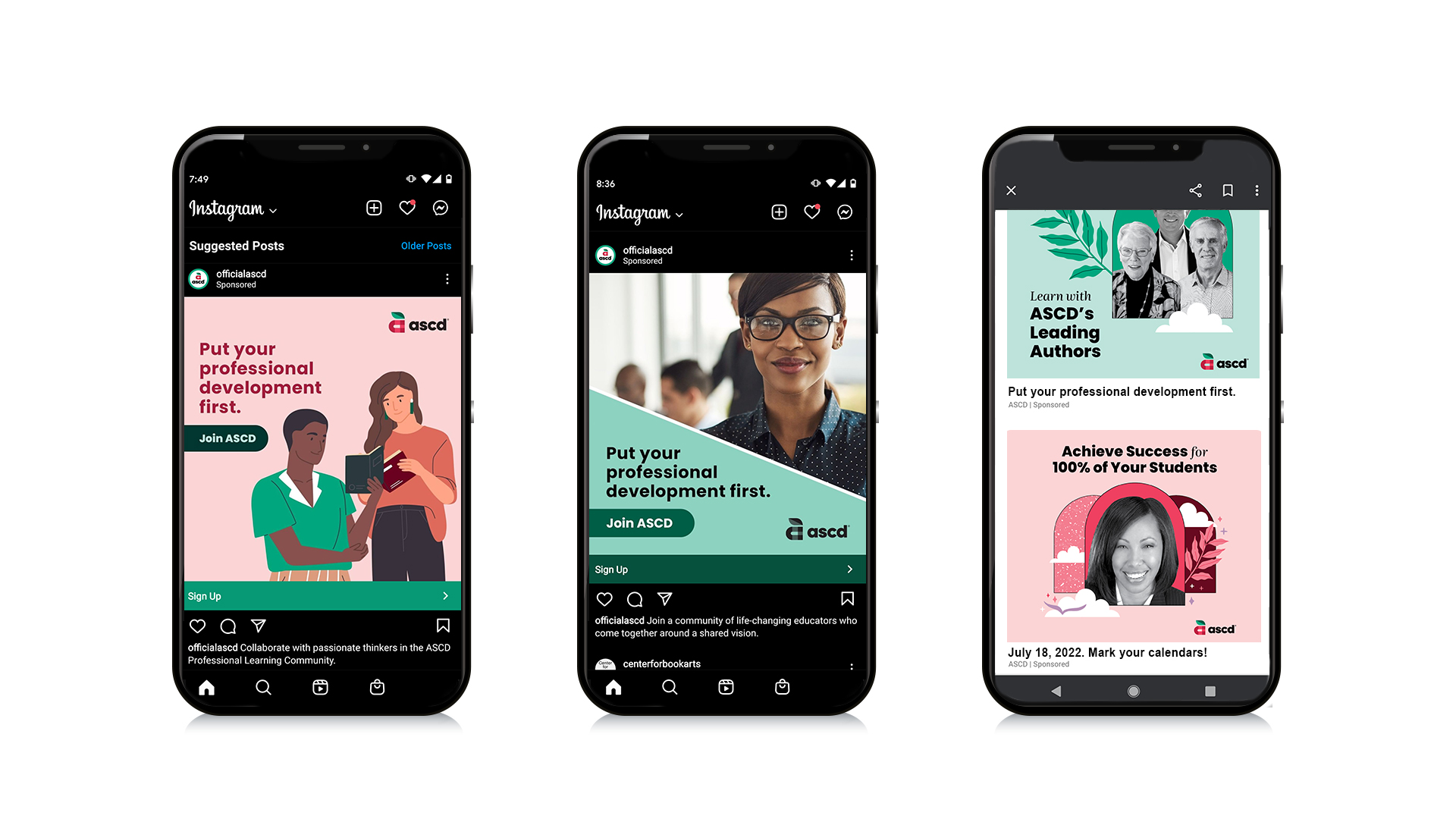
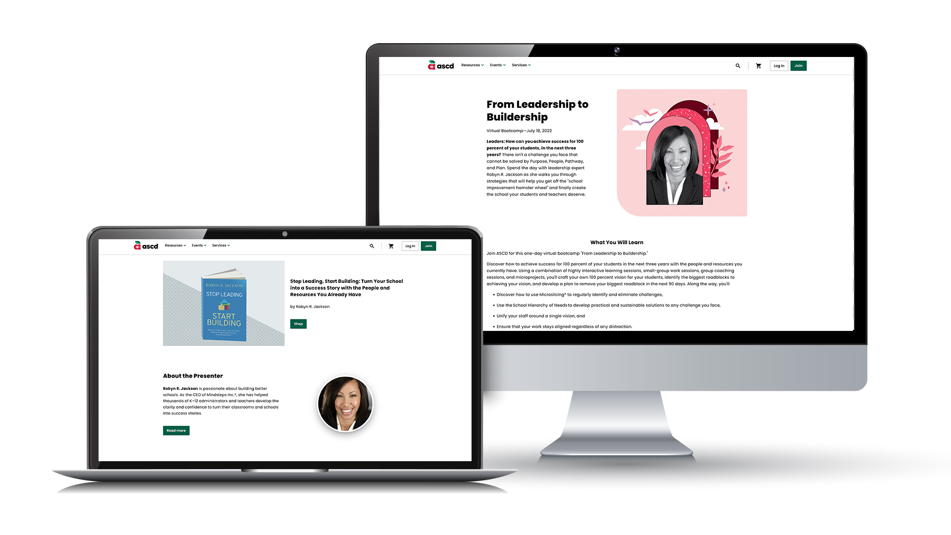
There’s many touchpoints that help craft that narrative. As Creative Director for ASCD, I lead, define, and maintain ASCD’s story brand in those touchpoints of Email, Social Media, Websites, Digital Publications, Digital and Print Ads, and Direct Mail.

Role: Creative Director
Key results for Storytelling and Engagement
:

  • Thematically integrate all outbound efforts by sales channels and marketing channels to increase open and click rates.
  • Simplify and unify storytelling to create brand trust to drive revenue

Where it Starts.

Brand Trust. ASCD has the legacy and reputation in the education field as the go-to trusted source for educator content. In the rebrand journey, we are aligning all brands under a new identity for educators. It is now time to simplify and unify our visual storytelling.

The first opportunity to help create brand trust and to unify our story was the strategic and consistent location placement of our new brand logo. At the top of every email and newsletter users receive so they know it can be trusted for its content, but also from whom it’s from.

Email

I lead the redesign our email templates to be simplified and cohesive with the brand. The goal is to engage our audience with our headline copy followed by imagery related to the content to help bring product and brand recognition. The emails were designed to be clean, and use white as the main background to keep text accessible for all users.

Our standard email template is showcased on the mobile phone. Our imagery always includes our branded element of the curve on the lower left. Followed by our call to action (CTA) button immediately to help provide that quick glance and action without having the user search for it. 

The tablet email is showcasing one of our other email templates. The goal of this email is to provide a quick scrolling experience of the products and services that we are promoting. We achieved this by using minimal copy and letting the images work for themselves as visual interests, but also as a CTA button. This template has proven to have higher click and conversion rates.

Newsletter

ASCD Delivers is ASCD’s membership newsletter that is sent out bi-weekly. Delivers is designed to stand out and signify to our audience that this digital piece is different. The way we achieve this is to emphasize that it’s an article is by bolstering the article title or theme of the newsletter. The size of the title is a nice, big, serif font, and kept on the green background to help bring that newsletter uniqueness. The main article is kept on white for accessibility. 

The newsletter can be broken into sections which can be used to carry on ASCD’s campaigns, and also promote products and services.

Social

ASCD utilizes organic social as a prime marketing channel to help tell ASCD’s story and campaigns. Visually, the goal is to maintain brand and storytelling consistency in organic social so when they get to a transaction point, the look and feel remains the same and maintains that brand trust. Overall, brand, messaging, and visuals need to create a conversation in the storytelling to keep interest and bring new audiences into the community.

Paid Ads

To help reinforce ASCD’s digital marketing channels of Email, Newsletters, and Organic Social is Paid Ads. Just like Social, visually the goal is to keep them consistent to reinforce brand trust. Messaging and design need to be further simplified in order to maximize the 2 seconds of viewing for the user. 

In the example ads below, ASCD uses a mix of diverse photography and illustrations to help have a friendly and relatable conversation with its audience. The illustration on the far left has been adjusted with brand colors in their clothing. The middle ad uses an ASCD branded element of the diagonal which can be found in the leaf of the “A” logo mark.

The example on the far right uses retargeting tactics. Anyone who visits our site and content for ASCD’s Summer Refresh will see these ads follow them to other sites.

Where it Ends.

The story has to have a conclusion, a final chapter. That final chapter for ASCD digital storytelling is a landing page on its main site. All images on the landing page remain consistent with all visuals that were used for the different channels. This to reinforce to the audience that they are in the right place. 

All the roads (tactics) lead to this one spot. This landing page has several importances, not just as a transaction point. This is where all our metrics and data that we’ve collected from the different marketing tactics turn into conversation rates. This is how we know what method, design, and messaging really worked and we can apply what we learned to the next story.